Firefox 106 Onboarding
Problem statement
Firefox's Major Release (v. 106) should be redesigned to accommodate more steps in the on-boarding flow, as well as increase the participation of users in the calls to action.
About the project
I was the lead designer for this project, working closely with a team of engineers and a project manager. There were a number of stakeholders, each responsible for different steps of the flow.
Some design work had already been done by an agency that was contracted, however their contract ended before any designs could be passed over.
Process
- Determine primary concerns regarding the previous on-boarding designs.
- Take over from previous agency that was contracted.
- Consult with stakeholders and engineers to finalize requirements for each step.
- User test initial designs to ensure clarity and identify early problems.
- Work with content design to create clear and concise copy for each step.
- Consult the a11y team early so any accessibility issues can be fixed quickly.
- Create imagery to support the primary copy on each step.
- Present designs to senior leadership to get approval before launch.
Concerns with on-boarding pre-106
Let me be clear, there was nothing “wrong” about the designs before Firefox version 106. But they had not been refreshed in a while, and there was some concern that the steps were difficult to find (the primary call to action was in the bottom right corner.)

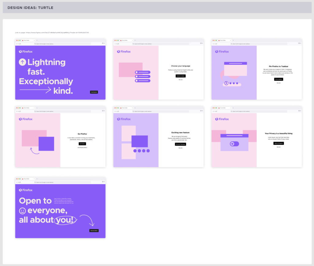
Prior work
Some initial brainstorming had been done by the previous agency, in consultation with the marketing team who are currently working on an updated brand toolkit for Firefox. These are some of their initial designs.
Brainstorming
Due to the initial designs from the agency, myself and my project manager wanted to keep as much work as possible. We decided that the split layout felt fresh, and gave us the opportunity to change the imagery for each step. This would make each step more engaging, rather than just the copy changing from screen to screen. However, it took a lot of work to come to this conclusion.
Limitations
One limitation we came across was that engineering would prefer if we have the same designs for both new users and existing users. This would ensure fewer bugs and code changes in the future once the steps are ultimately edited.
We user tested this screens many times; initially to test the locations of the buttons, which copy users found to be most understandable, and to see if the flow felt too long. We also engaged with the a11y team at this point, to make sure any button or background placement would make the usability difficult for those using assistive tech.
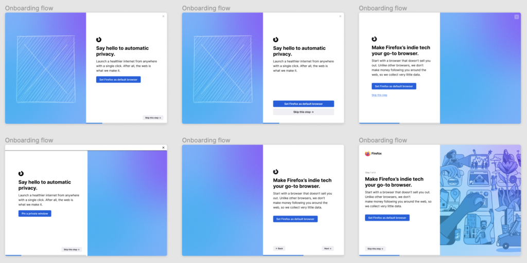
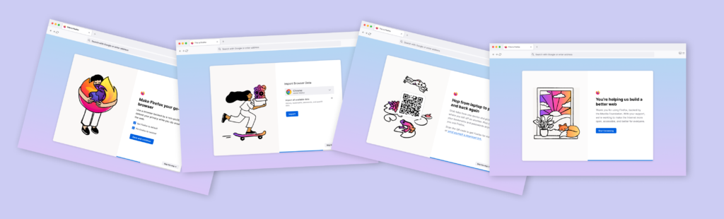
Final layout
The final layout was a split view, left hand image with copy in the middle of the right screen and with a primary CTA below the body copy, and a secondary CTA in the bottom right corner that would act as a “next” button.

Illustration styles
Multiple rounds of product reviews were held to determine the new direction for illustrations. At first, we were in the process of hiring an illustrator to do this work for us. However, the budget fell through and we had to go back to step 1. Since I revealed that I had some illustration skill, I was tasked with coming up with original images for each on-boarding step.
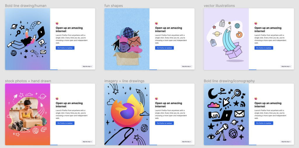
Final illustrations
Stakeholders and other designers decided on images of people (showing as little technology as we could) but with a hand-drawn feel. This was the final set of illustrations that I presented, and that were eventually approved.

Final flow
Due to elements beyond our control, certain steps in the on-boarding process were discontinued, meaning that not all of the illustrations created could be used.
If you’d like to see the on-boarding yourself, either download Firefox, or if you already have it installed, type about:welcome in the URL bar!
Mockup
